Tuesday, May 10, 2016

Navigation with a GPS device using a UTM coordinate system
Field Activity #12

Introduction-
    This field activity was a follow up from field activity #3 which the class was asked to create a map that could be used to located points of interest. Two main factors came into play when creating the map used for this activity, the coordinate system and the projection. To be able to successfully locate the points on the map it had to be in a UTM coordinate system. Our group was unfortunate with the map we used as it was in a Transverse Mercator projection. This would cause for problems with trying to locate our points on the map before finding them. By not being able to have a general sense of direction based on the map, our group had to rely on the GPS unit to navigate through the woods to locate our points. 

    To get a general sense of direction of our points, we used trial and error. By looking at the coordinates on the GPS device and cross referencing them with the coordinates for our course, we new that we had to be located in the southeast quadrangle of the course. Figure 1 shows the map that we used to give a sense of direction for our group. One major thing that would be nice to show on the map would also be the trails that wind throughout the wooded area. This would allow for much easier walking four our group as we were on a very steep hill for roughly half our coordinates. 
Fig. 1 is of the map that was used to give a sense of direction during this activity.
Methods-
    Our group was assigned five different coordinates that we were asked to find. The first coordinate was located in a very hilly region of the priory that was difficult to get to and find. Basing our navigation only off of the GPS device, we were winding back and fourth through the woods trying to get a bearing on the first point. After getting a direction established to go in, we ended up spacing ourselves out in a line allowing us to cover more ground to spot the point we needed. We knew that we were looking for a ribbon on a tree that would mark our first point. As our group continued along through this hilly environment, we realized that this was much harder due to the thick vegetation that we were experiencing. This would have been the point were we could have used the trails through the woods, if they were located on our map, to make travel much easier. Figure 2 shows the first point we found. As we were walking through the woods we were expecting to see a standing tree with a bright ribbon on it to make it easy to locate. This was not the case as this first point was an old tree that had been blown over and was laying on the ground making it difficult to see the ribbon.
Fig. 2 the first coordinate system attached to the fallen down tree.
    As we continued on with our coordinates and points to find, we began to gain a better understanding for trails running through the woods and how to utilize them to help find the remaining points. Our second coordinates were only located a few hundred meters from our first point, so we knew that we were in the general area. By using a few trial and error direction techniques based on the GPS location, we knew the direction we had to continue on for our second point. Figure 3 shows the location of our second point that we had found.
Fig. 3 is the location of our second point that we found.
     One mistake that we made was not being able to recognize that it would have been easier and less time consuming to find our third point before our second point as the third point was actually located closer to the first point. After realizing this we made sure to not make the same mistake again as this would be the case for points 4 and 5. The second point was located at the bottom of the steep hill that was home to the first point. This second point was located to the southeast from the first point roughly 200 meters away.
Fig. 4 is the location of point 3 located next to a busy road. 
     Figure 4 shows the location of our third point. This point was only 100 meters from the first point due east as this point would have been much easier to go to after the first point rather than backtracking from the second point. The third point was located near the highway as we could see the road and hear the cars humming by. By referencing back to our map (figure 1), we new that we were in the lower southeast corner of our map and almost out of room to the edge of the priory. We knew that we were going to be headed in a northwestern direction as all the points were located inside the priory.

    Figures 5 and 6 show the remaining two points that we were asked to find in our group. After locating the location of the third point, we realized that the fifth point was actually closer to point three then point four was. From learning from prior experience with points two and three, we decided that we would go find the fifth point first. This would allow us to save time finding these last two points. By gaining a bearing in a northwestern direction from the third point while using the GPS, we realized that the fifth point was also at the bottom of this large ridge. Seeing as we were already on the bottom of this  ridge and in a stand of pines that were lined in rows, the travel to this fifth point was relatively easy. This fifth point was at the bottom of this ridge, but was also at the top of another drop off. Before finding this point, we actually went down into this ravine thinking that the point was located at the bottom. Big mistake as it was only buckthorn and other prickly vegetation located down here. As we climbed our way out we spotted the fifth point. Figure 6 shows the location of the fifth point that we found.

    As we only had one point left, point 4, we knew that we were coming to an end. We actually found this point in the very beginning after point two as we were wandering through the woods but failed to realize it as it wasn't the point we were looking for. Knowing the location of this point and knowing that a trail lead directly to it, we knew the direction that we had to travel. We hardly used the GPS to find this point until we actually came across this point. As we came to this point, we marked it on the GPS and headed back to the parking lot of the priory. Figure 5 shows the location of this fourth point.
Fig. 5 shows the location of the fourth point while we are reading and gaining a bearing. 

Fig. 6 shows the location of the fifth point, but we found this point before point 5. 
    After completing the collection of all the points and saving them as we collected them on the GPS, the next step would to put these points on a map that would make sense. Before we started collecting the points in the field, we put a tracker that would plot points as we traveled with the GPS. This would show the areas that we covered while finding our points. Although the tracker would only collect points every 2 meters, we were able to use a tool that could convert these points into lines. The tool that was used was the point to line tool. It's a very easy tool to convert points into lines. Figure 7 shows the map we used along with the route that we traveled to find the points as well.
Fig. 7 Shows a track of the area that was walked during the field activity
Summary-
    As this activity was a spin off from activity three, there was nothing we could do about the coordinate system anymore that our map was in. In the third activity two maps were actually made, one in the transverse mercator coordinate system and one in the UTM system. Unfortunately the wrong map was printed off for this activity, causing much confusion and made us rely only on the GPS device. Although we were able to find all of our coordinates for this activity, it would have been much easier if we had access to the right map. This would have allowed us to gain a location of the points within 15 meters without even using the GPS device. One thing good about the map we did use however was that it showed the different elevation changes of the priory. If we would have had the elevation change and the right coordinate system, we would have been able to pick easier routes of travel to find the points. Although we didn't have the correct map, our group was able to communicate and work together to establish a system that would allow us to find the points. Without the group working together this would have been a very hard activity for one person to figure out on their own.


Monday, May 2, 2016

Construction of a point cloud data set, true orthomosaic, and digital surface model using Pix4D 
Lab Activity #11

Introduction-
    Pix4D is a cutting edge software created to make true orthomosaics along with point clouds from images gathered by hand, by drone, or by plane. This software allows the user to create 2D and 3D models of the images they have recorded. Pix4D is based on finding thousands of common points between images. This software uses something called key points. Key points are points on two images that overlap and align. The higher the overlap, the more key points that the software will find making for a more detailed end product.
    Before starting a new project it is important to understand how much overlap is needed when capturing images. In most cases one would like 75% frontal overlap with 60% side overlap. When it comes to dealing with sand/ snow or terrain that has little visual content, it is ideal to increase the overlap. This allows for images to maintain integrity while capturing the area of interest.
    Pix4D can also process images taken from multiple flights, however it is important to keep a few things in mind. It is important to make sure that the plans capture the images with enough overlap, and that there is enough overlap between the two flight acquisition plans. One of the most important steps to remember is that you would like to try to capture images from the two different flights under similar conditions. It would be hard to process images and make for a sloppy final product if one captured images when it is sunny and 80 degrees out one day, then came back and captured images again when it is 35 degrees out and the rain is falling sideways.
    Pix4D doesn't require one to use GCP's if they don't want to. Without GCP's the image would have no scale, orientation, and absolute position information. It is highly recommended that one uses GCP's when they have the option to.
    One thing that is very important to pay attention to when creating a project in Pix4D is to always view the quality report. The quality report is automatically displayed after each step of processing. This report displays all kinds of metadata and information about the images being processed. It gives information on the quality of the images that were used, overall summary of the project, and even talks about the given number of geolocated images. It is always important to take a look at the quality report to see if everything processed correctly. 
Methods/ Results-
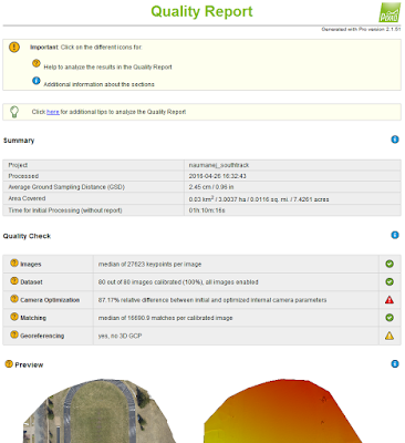
    This was the first time the field methods class used Pix4D for processing imagery so everything seemed confusing at first. One small hiccup that was experienced was that this was new software that was updated and when processing images, it took forever. The first step to creating the imagery is to create a new project. This allows the user to name their project along with bringing in the images they have captured. The images that were uploaded at this point were provided for the class, but didn't include GCP's.  Before starting to process the images, the class unchecked point cloud and DSM. We were only looking to run the initial processing. After the initial processing was completed, a quality report popped up on the screen. The quality report gave an overview of the images that were processed along with a preview of what the final product could look like (figure 1).
Fig. 1 Small portion of the quality report and its summary
One thing that one wants to look at when going through the quality report is the number of geolocated images. Although there were no GCP's with the images, it did have a GPS on board. This allowed for 80 out of the 80 images to be geolocated (figure 2). It is important to keep the quality report from all of the processing that is done in Pix4D, that way one can always go back to see basically the metadata from the project.
Fig. 2 showing that 80 out of 80 images are geolocated
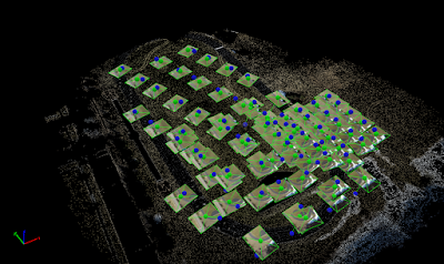
    After the initial processing is complete, the next step was to finish running the images through the point cloud and the DSM. By unchecking the initial processing and turning on the DSM and point cloud, this allowed for the software to run faster by not rerunning the initial processing again. The process of running these images through the point cloud and DSM could take a couple of minutes to an agonizing couple of hours. After the DSM and point cloud were completed the class ended with a crazy looking image (figure 3).
Fig. 3 Images after DSM and Point Cloud processing
Figure 3 shows the image that we gathered after completing these two processes. All the big green dots from figure 3 are the location of the images, while the blue dots are the geolocated points. To have this image make sense, by clicking triangle mesh on the left hand side, we gained a neat orthomosaic that makes sense to the eye (figure 4).
Fig. 4 orthomosaic of the track and field using the triangle meshes
    Now that we have gained our true orthomosaic, there were a few things that we were able to play around with. The class wanted to calculate the area of a surface within the Ray Cloud Editor, measure the length of a linear feature, calculate the volume of a 3D object, and create an animation that 'flys' through the project (figure 5/6).
Fig. 5 Finished map showing the volume of the building and the line distance

Fig. 6 The fly view from the ray cloud in Pix4D
    
Conclusion-
    Upon completing this lab activity, the class could now reflect on the final product that was able to be created using Pix4D. Pix4D is an complex mapping software allowing one to create 2D and 3D imagery. Although this was the first time that this software was introduced to the class, there are many more features and disciplines that this software can do. The tools used in this lab activity only scratch the surface of what this software is capable of as it can open the door to much more advanced processing techniques. From mapping tunnels, to using GCP's, this software can open whole new categories for job opportunities and business reports. 

Monday, April 25, 2016


Surveying with a Topcon Total Station and the Tesla GPS Unit
Field Activity #10

Introduction-
    The field methods class was introduced to collecting points using a total station the the Tesla GPS unit again. In last weeks lap, the class was only using the Tesla GPS unit. This weeks field activity goes in more depth, for more accurate data collection with using the Topcon Total Station (figure 1). The benefit of using a total station is that it can collect not only the x,y location values, but it can also collect the z value allowing the data to show elevation.
Fig. 1 shows a Topcon Total Station as it braves the elements. This device is very sensitive, needs to remain level and sturdy, and can't be bumped or moved during the recording process. 
One very important point is that the total station remains completely level and stable throughout the collection process. If the station is moved it throws all of the points off then. The device used to actually collect the points is called the prism rod (figure 2). This device allows for a laser to be shot out of the total station to the prism rod head and reflected back. By collecting and adjusting the data of the height on the rod, the elevation value is collected.
Fig. 2 is of a prism rod similar to what was used during this field activity. 
One major key to using the prism rod is that if the height of the rod is ever adjusted, it is very important to relay that information to whomever is recording the data with the Tesla. The last device that the class was familiar with already is the Tesla (figure 3). This device is what is used to collect the data for this field activity. The program used is called Magnet. It allows for the x,y, and z values to be recorded while maintaining data integrity.
Fig. 3 is of the Tesla GPS unit used to record the data in this field activity. 
Study Area-
    The study area for this field activity was nestled down by Little Niagara Creek between the Davies Center and Phillips Hall on campus. It was relatively a small area, about one hectare, that the data was being recorded from. Seeing as this was the classes first time using the total station, it was a perfect size. Study area to the East of the small bridge.
Methods/ Results-
    Before collecting data there is some very important things to do with the total station to make sure your points are accurate when collecting them with the Tesla. The first process is to get all the gear setup and pick the starting point that you are choosing to collect the data from. This start point is known as the occupancy point (where the Topcon Station will be sitting). Along with the occupancy point, the back site point also needs to be collected. The back site point is used as a spatial reference and used to calculate the height of the total station.

    Once these two points were collected, the total station was put over the occupancy point and is leveled. It is important to have the total station as close as possible to being directly over the occupied point along with having it as level as possible. There is a bubble level on the total station which is used to keep it level. After it is leveled, the three legs can be stepped down on securing it in place.

 
    Now that the total station is ready, the points in the study area can be collected. Unlike the HiPer when the entire station was moved around, only the prism rod (figure 2) is needed to collect the points. By aiming with the iron sight located on top of the total station, then using the magnified sight in the total station, it is key to line the sights up with the middle of the prism (figure 4). By doing this the distance, azimuth, and elevation is all collected on the Tesla (figure 5). 
Fig. 4 Total Station with Iron sight on top and magnified sight in the middle


Fig. 5 Tesla while recording points from the total station
    After all the points were recorded and collected from the different groups, it was time to process the data. The data was brought in as a '.txt' file (figure 6) allowing it to be easily brought into ArcMap. Once the data was imported into ArcMap, it was time to map it. To show the different elevations from the data an interpolation tool was used. The tool that was used was the Triangulated Irregular Network tool or TIN for short. This gave us a 2D imagery of the points along with different elevations heights (figure 7).
Fig. 6 .txt file of the data
Fig. 7 2D TIN imagery of the data gathered with the lighter colors being higher elevation. The dark area slopes down towards little Niagara creek while the lighter area is towards Phillips Hall.
After creating a 2D TIN imagery in ArcMap, it was time to see what it would look like in 3D imagery. By bringing the data into Arcscene it is possible to see the different rise and fall in elevation. Using the same interpolation tool as before, TIN, the 3D image was created. One thing however of this image is that there isn't a big difference in the elevation of the area that the data was gathered from. This leaves a 3D image that is hard to tell a big difference in elevation other than the color (figure 8).
Fig. 8 3D TIN created in ArcScene allowing us to see the difference in elevation. This was the view from the total station with the left corner being North.


Conclusion-
    After comparing the 2D imagery and 3D imagery, it is hard to really see an elevation shift between the two. Yes, the 3D imagery is easier to tell when zoomed in, but to really show the difference's in elevation there could be a few things to do. One would be to use a different interpolation tool that would allow from more elevation change, and another would be to use the total station to gather data in a more sloped area along Little Niagara Creek. If the goal of the lab was to show slope and elevation change, I would explore both possibilities.
    By using a total station for this assignment we were able to collect very accurate data. Although it takes more time to prepare the total station for collection compared to Collector or another device, it does allow one to collect very accurate data. It is important however to know if one needs this accurate of data for the job description they are doing. It's always important to understand and use the right equipment for the job. 


Monday, April 18, 2016

Surveying of point features using Dual Frequency GPS
Field Activity #9

Introduction-
    This weeks lab taught how to engage in a survey of various point features on campus using a high precision GPS unit. Features will be selected based off of codes that are already created for this project. The collection of these points allows of maps to be created for the study area on lower campus.

Study Area-
    The study area that was being focused on was the lower portion of campus for University Wisconsin- Eau Claire. Click here to see the study area of the lower campus portion. One thing to note of is that sometimes GPS units can be thrown off when standing under trees when they are full of leaves. Since this field activity is being conducted in early spring, there won't be an issue with collecting the points and possibly have even a higher accuracy then if this was conducted in the middle of summer.

Methods/ Results-
    With the class being broken into teams, each team would collect points outside on campus of either light poles, trees, garbage cans, or bike racks. The dual frequency GPS unit used to collect these points was called the Topcon HiPer (figure 1).
Fig 1. the Topcon HiPer located on top of the pole and the Tesla which is attached at the middle/ handheld.
The Tesla is the handheld device used to store the points collected in this field activity. One major key to note is making sure that the devices were as level as possible, mainly the HiPer. Without the HiPer being level, it would cause for the data to be skewed. When the data was ready to be collected, the Tesla was activated  to collect the GPS point wirelessly from the HiPer through Bluetooth. While the HiPer was collecting, it would give a reading of horizontal and vertical distance of how much it was off. The Tesla would continue to record 20 points in the same location as the horizontal and vertical distance continued to shift (figure 2). It would then take the average and give the reading of the point.
Fig. 2 Rachel collecting a light pole point. She is waiting for the 20 points to average out so she can save the point.
After completing the collection process of the various points, the data was then exported as points in a '.txt' file (figure 3).
Fig. 3 is the location of all the points recorded from the class.
This file would give X and Y coordinates allowing it to be used with the import XY tool to bring the points into ArcMap. After the point coordinates were brought in, an interpolation tool was used allowing the points to show the different elevations of the lower campus portion. The interpolation tool that was used was the triangulated irregular network or TIN (figure 4).
Fig. 4 is of the TIN showing the different elevation of the points we gathered, mostly of the parking lot.
 Looking closer at figure four, some interesting features are shown. There is a high spot relatively in the middle of the parking lot, assuming this is for drainage purposes. The high point is only a meter above the low point run offs, but that is all that is needed to keep the water flowing. There is also a high spot in the northwest corner of the study area. Here was an elevation increase from the sidewalk and landscaping made to this area. This area allows for drainage then to run along the base of it to different lower areas. Figure 5 compared to figure 4, shows just the points collected in the parking lot area of Davies. This gives a relative reference to show why certain areas have higher elevation than others.
Fig. 5 giving locations of the points in the Davies parking lot.


Conclusion-
    After completing this field activity there were a few things that were learned. Using the Topcon HiPer and Tesla is a good way of recording points if one has a wifi connection. Without that connection there would be a problem with trying to save the points of the location. This device is used to get very accurate data.

Monday, April 11, 2016

Distance/ Azimuth Survey Methods
Field Activity #8

Introduction-
    This lab is intended to show us that you can't always rely on GPS because there can be technical difficulties at times. When the GPS goes down, it is a good idea to have the knowledge and know how to be able to still collect points in the field that are relatively accurate. One way to collect points is through using angles and distance to calculate points, this is called using the azimuth. 

There is a few different techniques used to collect the azimuth, but the easiest and seemingly most accurate happened to be a Tru Pulse Laser (figure 1). The azimuth is a reading between 0 and 360 degrees, and can also be found with using a compass.
Fig. 1 TruPulse Laser 360 allowed for us to read the distance in meters, along with being able to find out the azimuth
Study Area-
    The study area was an exact point outside Phillips hall that all the measurements were conducted from. Since the weather was crappy this day, this lab was a condensed version but still were able to collect enough points to make a detailed map using the azimuth. Click Here below and you can see roughly the location that this experiment was conducted at. Click here. The location was right at the 'Y' in the sidewalk looking towards the north, northeast. The reason this location was chosen was because there was a good starting point were the sidewalk made the 'Y', and there were plenty of trees that we could gain an azimuth reading off of. 

Methods-
    For this activity more than just the azimuth of the tree locations was collected. Also collected were the diameter of the trees, distance from starting point to trees, species, and X,Y location. Figure 2 shows the table that was used to bring the points to life in ArcMap.
Fig. 2 the table and attributes that were collected during the activity.
The first step to collecting these points was to have one person go stand next to the tree while the other was standing at the starting point. The person by the tree would collect the diameter and species type of the tree. The person at the starting point would use the laser finder to collect the distance to the tree and the azimuth. There was a couple of different settings when using the laser finder, but one thing that had to be done was to make sure the distance was read in meters and to have it on the proper setting when recording the azimuth. Looking back at figure 1 there is two buttons on the side of the laser, these buttons would allow one to scroll through the setting until they would reach distance and azimuth. One trouble that the group seemed to experience was reading the different settings and numbers in the laser. It was a chilly, windy, and a rainy day out. These combined to fog up the lenses along with leave moisture on them causing it difficult to read. The only way around this was to continually wipe off the lens before reading the next tree. 

Results-

    Upon the completion of the collection of the points outside of Phillips Hall, we were able to then come back inside to process the points that were collected. A table was setup (figure 2) with all the attribute data collected. It was important to keep this table as simple as possible for the benefit of the tool that was about to be used. The tool used was 'bearing distance to line'. This would give the lines from the starting point to the tree location based upon the azimuth. The next tool used was the 'feature vertices to points' tool. This tool was ran twice seeing that it can select the starting point or the end points "tree points" in this case. The starting point was based off of the X,Y location from the attribute data. The tree points were calculated using the distance data from the X,Y location and the azimuth. With these two tool, a map was constructed for interpretation of the points and data that was gathered. Figures 3 and 4 are two different maps created from the data gathered during this activity.
Fig. 3 diameter of tree points collected based off of the attribute data.
 
Fig. 4 different species of trees collected.
Conclusion-
    The purpose of this lab was to expand knowledge in a scenario when a GPS or ground station stops working. An easy and fast remedy would be to use azimuth to collect points of interest. It is always smart to have a backup plan before going into the field and conducting an activity. Technology is not always reliable, as this lab would prove, but if one has a backup plan that works they would be prepared for any situation.


Monday, April 4, 2016

Gathering Data Using Arc Collector
Field Activity #7

Introduction-
    For the 7th field activity we were asked to pose a question, create a database, and collect and project data that was collect to try and answer the question that was posed. This would be the first lab that we create and use our own database to answer a question that we came up with. The question I wanted to find out was: which faculty parking lot on  campus has the most full sized trucks parked in them. When thinking of this question many thoughts went through my head. Is there enough trucks on campus to validate my question, which parking lot would have the most, would weather pose a factor, and how could this data be used to benefit insurance companies. 
    When it came to the creation of the database there were a few guidelines that had to be followed. In the feature class there had to be at least three fields to enter attribute data, one of the fields should be a text field for notes, one should be a floating point or integer, and one should be a category field. With following these guidelines along with properly setting up the database, it would be easier to compile the data in the field. Having proper database design is essential to keeping data organized and valid while collecting the data. By properly creating a database, collection time of data can be cut down on. Another thing to keep in mind is that it's not always the creator collecting the data. By having proper alias fields for the collection crew, one can make sure that they know what the collector means during the collection of the data. It is also important to have a notes field so the collector can document anything they believe that the database creator had missed. 

Study Area-
    Since the question I posed was about the campus faculty parking lots, my study area would be on campus. I chose two of the major parking lots to look at for my question, the Hibbard parking lot, and the Davies parking lot. When deciding on these parking lots, I knew that these were the largest ones on lower campus. I also knew that they would have to most traffic in them letting me to obtain the most data for my question. Here you can see the study area of the lower campus region that the data was collected from. Hibbard lot is in the upper right corner, while the Davies lot is in the lower left.

Methods-
    The data for this project was collected on a Friday from 2:30 pm till 3:30 pm. Since sections of these parking lots open to the "no pass" vehicles at 3 pm, I wanted to see how many trucks would be in these sections before and after 3 pm. I also knew that by collecting this data around these times that there wouldn't be an insane amount of trucks in either of the parking lots, but was surprised by the data that I found. Before the collection of the data I believed that Davies parking lot would have more data collected than the Hibbard lot. The Davies lot is much bigger so I figured this would come into play for more data. I was wrong and Hibbard actually had more trucks in the lot. 
    Another problem I had when collecting the data for this project question was maintaining the integrity of the location of the points. When collecting the data I wanted to stand directly behind the trucks allowing for all my points to be consistent. Although I stood behind the trucks directly while gathering the points, another problem then came into play. Arc Collector is not all that accurate, in figure one you can see what I mean. 
Fig. 1- Location of three points collected using Arc Collector that are not accurate. 
Figure 1 displays three different points from data collected in the Davies parking lot. Clearly there is not trucks parked on the sidewalk or on the grass, but when using Arc Collector since it is not all that accurate at times I was left with these points. This leaves some of my data skewed, because at other times as in figure 2, the points collected are exactly where I was during the collection of the points.
Fig. 2- Location of three points that are accurate with Arc Collector.
Figure 2 displays points that were collected using Arc Collector that were accurate to where I was during the collection process. Although these are accurate, and the points in figure one are not, this leaves my data integrity up in the air. One way to prevent this would be to use a more accurate data collection process. Another way that this could have been avoided was to use a more accurate location fix by being connected to WiFi.

Results-
    The data that was collected for each of the parking lots was a shock to me. As I mentioned before, I first believe that Davies lot would have more full sized trucks considering that it was a larger parking lot and seems to have more traffic flow. With the more traffic flow, I also believed that there would be more accidents in this lot due to having large vehicles parked there. Having a larger vehicle would be prone to dinging doors of other cars, or side swiping them when trying to park/ leave a parking space. If data like this would be presented to an insurance company, they could potentially come up with a policy stating that large trucks could only park in designated parking spots. Although this may be unpractical, it would be a way for insurance companies to save money potentially. Figure 3 shows all the full sized trucks parked in the Davies parking lot.
Fig. 3- All the full sized trucks parked in the Davies parking lot. 
    After the collection of the data in the Davies lot was complete, I moved onto the Hibbard lot. The Hibbard lot is located right on a busy street and tends to only allow faculty parking until 6 pm. Since only faculty could park here, I believe that this would have a factor in not having as much traffic and not as much full sized trucks in this lot. Figure 4 shows all the trucks parked in the Hibbard lot. 
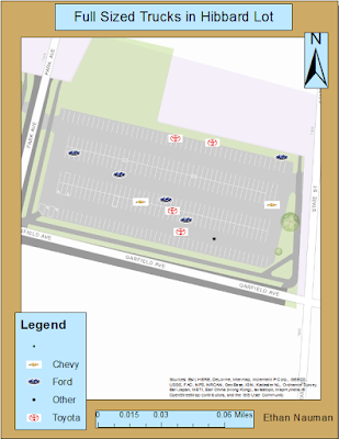
Fig. 4- All the full sized trucks parked in the Hibbard lot.
After looking at the data collected it is easy to see that the Hibbard lot had more full sized trucks parked there between 2:30 and 3:30 pm. This shows that there was more traffic during this time of the day at the Hibbard lot for faculty members. The final map displayed in figure 5 shows both the Davies and Hibbard lots and all the trucks parked in them. 
Fig. 5- Davies and Hibbard parking lots.
    Although I only focused on the Davies and Hibbard parking lots, there are also other lots on lower campus that can/ do have trucks parked in them. Some of these lots are meter lots, and some of them are small and have campus work trucks parked in them. It would be interesting to expand my research question to incorporate these lots and to find and determine the consequences that these large vehicles could have in these lots as well. 

Conclusion-
    Without proper database design it would have been difficult to gather all the data I needed in the field. The database I created allowed for me to have a drop down of the make of the truck and how many trucks there were. I also had a notes field and incorporated an estimated year field. I could make lots of different maps incorporating all these fields together, but focused on how many trucks were in each lot based off of my question. One thing I would have done differently for the question would be to incorporate SUV's and other large four door vehicles. Trucks are not the only large vehicle that has a problem in tight spaced parking lots leading to accidents and dings and scratches. By expanding and cross examining the information from insurance companies, I believe that the conclusion would be to have a section just for trucks and large vehicles to park in some parking lots. This could lead to fewer insurance claims and make everyone happy. There is nothing worse than coming out of class and seeing that you have to squeeze between cars just to get your driver door open eight inches to mutate into an octopus to get into the drivers seat. 

Monday, March 14, 2016

Using Arc Collector 
Field Activity #6

Introduction
The collection of data in the field can be tedious work depending on the device you use to collect your points of interest. ArcCollector is a very simple way to go about collecting data that is both efficient and easy to use for all alike. ArcCollector doesn't take a lot of know how if one is knew to this method of collection. In this lab I used ArcCollector on my iPhone 5 to allow me to collect the points I wanted. This is compared to using a GPS unit which isn't always at hand or is overboard for the data points you are collecting. One problem with ArcCollector is that it isn't all that accurate on a phone. When I was connected to the campus WiFi, I was able to be within a couple of  meters of the points I actually collected. When not connected to the WiFi, but using LTE network coverage, my points were sometimes 20 meters off when I was walking. The LTE coverage did seem to hone in on my location when I was at a stand still and brought it back to within a couple of meters. It is important when collecting points to use the appropriate method of collection. Without the appropriate method your data can be drastically off and you may not be able to use it for the job you are doing. 

Study Area
The study area I was looking at was the lower campus area along the Chippewa river. I was able to collect 20 points in a small area up and down the banks of the river. While I was collecting these points, other members from my class were also collecting points all across the lower campus. By combining our points in a temp file at the end of the collection, we all were able to use each others data allowing for more accurate methods when plotting the information. 

Methods
With the data that was collected, I created one map of just the data I collected. I choose to create a unique values map based off of the temperature along the banks of the river. I choose to use a color ramp that had my cooler temperatures as a blue color while the warmer temperatures were a red color. The day we collected this data was March 8th, which is typically cool out, however it was unseasonably warm as temperatures were in the low 70's. While plotting the temperatures, I also changed the sizes of the points collected. I wanted to show where the warmest and coolest temperatures were so I made these symbols slightly bigger then the rest. 
Figure 1 is the first map I created with only using the data I collected in ArcCollector

With knowing that there was lots of data that I could tap into to create maps from ArcCollector, I decided I wanted to make a form of a wind map. I decided on a wind speed and wind direction map. With uploading the rest of the data from my classmates into ArcMap, I started with a graduated symbols map with wind speed being the value the map would be based on. After selecting the value I changed the symbol from just a dot to an arrow to allow me to show the wind direction. In an advanced setting in the symbology tab, I was able to integrate the wind direction allowing my arrows to "rotate" or change the direction they are pointing. This is the first map I created like this so it was by a means of trial and error, but after looking at the map it is easy to see that the highest winds tend to be closest to the river banks. 
Figure 2 is my wind speed and wind direction map

Discussion
Comparing ArcCollector to a form of a GPS to collect points, hands down ArcCollector is much easier when trying to collect points. The only downfall comparing the two is that ArcCollector is less accurate compared to a GPS unit device. 

Conclusion
This field activity was used to teach us the process of using ArcCollector to capture points and to create maps out of the data we collected. One thing for certain is that ArcCollector is much easier to use to collect data, but when it comes down to the job you are on it can have less accurate positioning. It would be important to understand an appropriate time to use Collector instead of a GPS unit. 


Wednesday, March 2, 2016

Geodatabases, Attributes, and Domains
Field Activity #5

Introduction
    The objective of this lab was to introduce us to collecting field data based off of a database we created. Databases are a collection of different datasets that allow us to set variables for the data that we are collecting. We wanted to collect different points across the UWEC campus with handheld GPS units. When collecting these points we wanted to use the databases we established in lab to give us detailed information about the points. When collecting the points we wanted to collect temperature, wind speed, wind direction, relative humidity, and dew point for the points we were collecting. By collecting this attribute data for our points, we can paint a better picture of the surrounding area that we are collecting these points from. 

Study Area
    The study area that we looked at in this lab was the UWEC Campus. This lab was taken place in February, meaning that it is cold and winter time on campus. The conditions of this time of year are typically dry with wind whipping throughout the campus. In the next portion of this lab we will have designated areas for us to collect our points and attribute data from which we will then be put into a large database system for everyone in the class. 

Methods
    When creating our geodatabase domains for this lab it is important to have the right range values for the data that we are collecting. Knowing that it is winter time on campus a safe range for the temperature range would be from -10 to 40 degrees this time of year. When collecting data in the field it is easy to hit the wrong button or put the wrong number in a spot. With having this range on the temperature set, if I said the temperature outside was -100 degrees instead of -10 degrees, I would know instantly in the field as this value wouldn't be excepted. This would allow me to correct this problem in the field instantly. A correct domain is essential for the collection of these points in the field. The domain insures that the data is accurate and consistent while having data integrity. 

    Although only a few points were collected in this lab to just get us started, the data information along with the domains and rules established allowed me to have accurate data. The easiest way to gain more data would be to collect more points with the GPS units. At first this may seem like the easiest way to go about obtaining more data, but dividing and conquering would be even easier. With having a domain established for the whole class, we could then go in different directions to collect these points while keeping data integrity. We could then upload this data into a class geodatabase allowing us to plot these points in Arcmap to show the different data we all collected. There would be many maps that we could make just from the small amount of data and attribute data we collected from our points. 

Conclusion
    Anyone who owns a GPS unit can go out in the field and collect data points of their choice, but it is the setup before collection that allows people to be able to understand and collect more accurate data. Geodatabase domains are essential to properly allow you collect data in the field, while being able to look back at your data and make maps that make sense of what you are trying to map. With using domains, one can put ranges on the data they collect along with establishing if it's numeric value, text, or integer data that they are looking for for a specific data type. The more in depth one is at the stage of setting up their domains and attributes before collecting their points, the more accurate the data points are. 

Monday, February 22, 2016

Development of a Field Navigation Map
Field Activity #3 part 1

    The start of our third field activity deals with learning our pace count, determining what all to place on a map, and the creation of two maps for future parts of this field activity. By combining all three of these in a future part of our lab, we will be able to locate and navigate to waypoints on the maps we created and find them in the woods. 

    A pace count is a means of measuring distance over a period of time. By using the scale on our maps, we should be able to combine that with the knowledge of our pace count to complete the location of the way points. The way we determined what our pace count was was by stretching two tape measures out all the way. The tape measures were each 50 meters long, so we had a total of 100 meters. When walking to learn your pace, you want to count with only one foot. I used my right foot, so every time my right foot touched the ground I counted, 1, 2, 3, and so on. I recorded my pace count twice and each time it was 65 1/2 steps to cover the 100 meters. Now that I had my pace count it was time to create the two maps I would use them with. 

Before I could create my maps, I first needed to look at the data that we would be using. When viewing the data the two major keys I took into factor when choosing was what was the coordinate system and what projection the data was in. The coordinate system for the first map was the NAD83 Wisconsin Transverse Mercator, with a Wisconsin Transverse Mercator for the projection. NAD83 is a highly used coordinate system in North America. The Transverse Mercator projection stems from the Mercator projection. This projection delivers a high accuracy within different zones less than a few degrees apart.  Knowing that this coordinate system and projection will allow me to view my study area, I used the same projection on the second map and changed the coordinate system slightly. I used the NAD83 UTM Zone 15N coordinate system. This systems is smaller and would give a little better real world showing on the second map. 

    The data that was used to create the maps were provided from our professor. The data was from the Priory database that contained pictures, points, contour levels, and research boundaries. The first map I created I decided to use real time color imagery of our research area. Although it's hard to make out different types of trees in the wooded area, I am able to see different stands of vegetation along with fields, buildings, and water. This first map used the NAD83 Wisconsin Transverse Mercator coordinate system. Although this coordinate system is defined to this area, my second map uses a more defined coordinate system. Knowing that this wasn't enough by itself, I decided to overlay the research area with two foot contour lines. This would allow me to know if I am going up or down hill when in the field. I feel that having the contour lines on the map is the most important feature class to use. On the first map, I have also included the research boundary area with a red box outline, have the north arrow, and also have a scale bar. With know my pace count now, I can use the scale bar with a few conversions to know close to the area that I will be at. In figure 1 I have my map 1. 
 Figure 1

    The second map I created was similar to the first map. I used black and white color imagery that used the NAD83 UTM Zone 15N coordinate system. This coordinate system is smaller and finer compared to the first maps coordinate system. Like in the first map, I also included the two foot contours allowing me to show elevation changes. I also included the scale bar, north arrow, and research boundary area again. With these two maps and my pace count, I should be able to locate the waypoints that we will use in a future part of this lab. Figure 2 shows my second map. 
 Figure 2

    Like I have stated before, this is only the first part to this field activity. With the creation of my two maps, along with my partners maps, and my pace count, I should be able to use these to locate the different way points in the future of this field activity. Currently not knowing what my partners has on his maps, I am curious to see what his looks like and to compare. 


Monday, February 15, 2016

Visualizing and Refining Terrain Survey
Field Activity #2

    This field activity is a follow up from the previous weeks field activity of surveying the terrain surface. In the previous field activity we were asked to create a terrain surface in one of the planters boxes in the courtyard. Since it is winter time out, we used snow instead of sand when construction our surface terrain. After construction our surface, it was now time to figure out the best way to survey the area. We used a systematic sampling method, which allowed us to overlay the terrain with a grid so we could take measurements for all of the different types of terrain. Figure one shows the grid system that we used. It was constructed with yarn and thumbtacks.
 Figure 1
While we were getting measurements for our entire terrain model, we were also recording them onto a piece of paper. We got the x the y and the z coordinates for 180 different points in our flower box terrain model. We then were able to transfer all these points into an excel file so we could eventually bring those points to life in ArcMap and ArcScene.
    Now the real fun began of being able to display these points in ArcMap allowing us to render a 3D display of all our points. When we first brought our points into ArcMap and Scene, all that came across were the points in a grid format. We used five different interpolation techniques that would allow for us to show these points in a 3D format. The first interpolation technique that we used was the Inverse Distance Weight technique. IDW determines cell values using a linearly weighted combination of a set of sample points. One reason why I didn't like IDW was because it doesn't take into effect the areas in between two points. For instance, look at the top of the mountain in figure 2. Our terrain model was more of a plateau on top of the mountain, not two different peaks.
Figure 2 shows the Inverse Distance Weight interpolation technique.

The next interpolation technique we used when dealing with the data was the Natural Neighbors method. This method finds the closest subset of input samples and puts them into a query point and applies weights to them based on proportionate areas. This technique works best when there are data clusters in the data set points. Figure 3 shows the natural neighbors interpolation method.
Figure 3 shows the Natural Neighbors interpolation technique. You can see how the surface of the terrain is much smoother in areas compared to the IDW method. It's also worth noting that the top of the hill is also more of a plateau like it actually was in our terrain.

The third interpolation technique we used was the Kriging method. This method is Gaussian process regression that models the points based off of their prior covariance's. The assumption is that there is some type of correlation between the points. Without there being any correlation the points would be lost and would be put randomly onto the map. Figure 4 shows the data in the Kriging interpolation method. This is one of my favorite techniques however when I turned the 3D model onto the side the hill and the ridge ended up being rather pointy, and this is not how it was modeled in the actual terrain.
Figure 4 shows the Kriging interpolation technique.

The fourth interpolation technique we used was the spline method. This method estimates values using a mathematics function that minimizes overall surface curvature, resulting in a smooth surface that passes through exactly the input points. To me this was the most visually please technique that we used.  Figure 5 shows this technique.
Figure 5 is the Spline interpolation technique. You can see that there is no pointy areas rather everything is smooth and blends into one another. This was one of the main reasons why I believe that this one was the most visually pleasing technique we used.

The fifth and final interpolation method was used was the TIN method. A TIN is a Triangular Irregular Network that uses non overlapping triangles allowing to show the surface features. This tends to be very rough and not pleasing to the eye, but it does display surface data. Figure 6 shows the TIN created from the survey grid.
Figure 6 shows the TIN interpolation technique used.

After creating and using these different interpolation techniques, we were asked to look at our data again and to see if there were any areas that we felt would benefit from having more points in that area. Of course there is always room for improvement when looking at data like this so we decided to concentrate on the hill, portions of the valley, and the ridge in the back.

We devised a way from looking at our data that we already have and the area in the planters box outside that we were able to get 16 more points of x,y, and z data for our terrain. After getting this data we put it into another excel sheet and imported it into Arcmap which would allow us to overlay the data onto the previously displayed data points. Figure 7 shows the new point data we collected from our planters boxes.
 Figure 7, With this data being in between other points, it will allow us to give a better representation of the areas that have steep slopes.